


F1 team logos are more than just images - they tell stories about history, values, and future goals. Here's what you need to know:
| Team | Strengths | Weaknesses |
|---|---|---|
| Ferrari | Strong legacy, emotional connection | Less adaptable for digital formats |
| Red Bull Racing | Consistent, modern branding | Minimal innovation |
| Williams Racing | Digital-friendly, clean design | Limited storytelling depth |
| Kick Sauber | Fresh, bold design | Lacks historical recognition |
F1 logos evolve by blending tradition with modern trends, ensuring they resonate with fans and adapt to new platforms. Whether focusing on heritage or innovation, these logos shape team identity and connect with audiences worldwide.
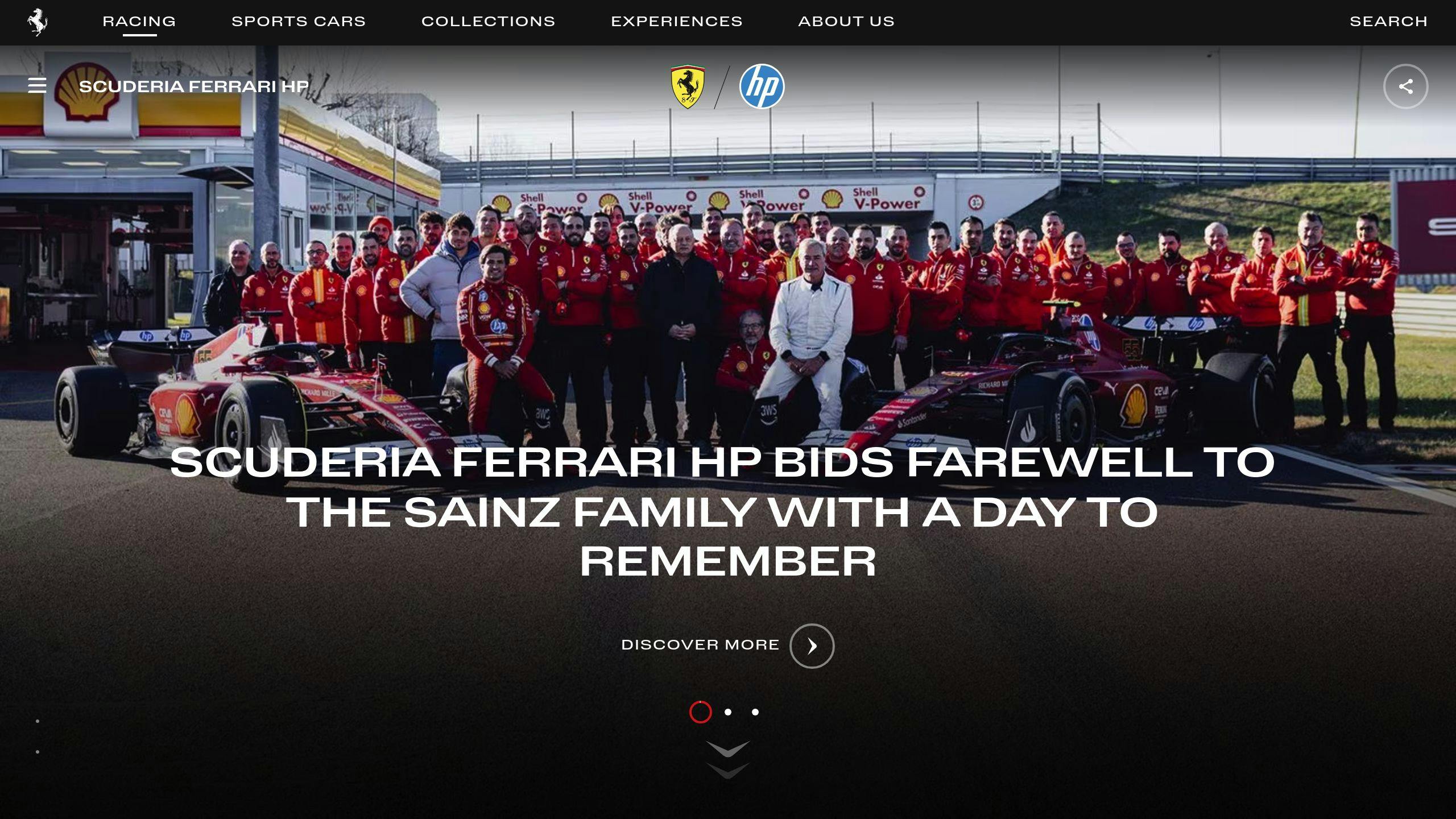
The Ferrari logo is one of Formula 1's most recognizable symbols, representing a legacy that stretches back to 1929. The prancing horse emblem, originally created by Count Francesco Baracca, has become a global icon of racing excellence and Italian pride [1]. It seamlessly combines historical significance with a modern touch.
In 2024, Ferrari brought back classic design elements with subtle updates, blending tradition with a fresh perspective [1]. This update shows how timeless designs can evolve to stay relevant while maintaining their core identity.
Here’s how each part of the logo reflects Ferrari’s brand:
| Design Element | Brand Significance |
|---|---|
| Prancing Horse | Stands for power, speed, and instant recognition |
| Italian Tricolor | Highlights national pride and emotional connection |
| Classic Typography | Reflects the brand’s legacy and historical depth |
The logo's strength lies in its clean design and balanced proportions. Its use of bold yet simple colors ensures it stands out, whether on a race car or a piece of merchandise. This approach has made the prancing horse emblem a symbol of both racing dominance and luxury, embodying passion and excellence.
Ferrari’s logo is a great example of how design can connect a brand’s storied past with its future ambitions. While Ferrari leans on its heritage, other teams like Red Bull opt for a more modern and energetic branding style.
The Red Bull Racing logo takes a bold and modern approach, offering a sharp contrast to Ferrari's more classic style. In 2024, updates brought a sleeker typeface and a refined color palette, all while keeping the iconic charging bull emblem intact [1].
The logo's elements are carefully crafted to reflect the team's identity:
| Design Element | Represents |
|---|---|
| Charging Bull | Power, aggression, and the team's forward momentum |
| Bold Typography | A sense of modernity and energy |
| Color Scheme | A nod to Austrian roots and energy drink origins |
| Streamlined Design | Highlights speed and cutting-edge technology |
This logo strikes a perfect balance between simplicity and impact. Its bold design mirrors the team's aggressive racing style and focus on innovation [1][2]. Red Bull's forward-looking approach is evident in this design, which challenges traditional F1 aesthetics and reinforces their image as a high-energy, unconventional brand.
The logo is particularly effective in digital spaces and on merchandise. Its clean lines and strong visuals resonate with younger, tech-savvy fans [1]. While it may not carry the historical weight of older F1 team emblems, its contemporary style aligns seamlessly with Red Bull Racing's position as a modern disruptor in Formula 1 [1][2]. This fresh approach has cemented Red Bull Racing as one of the most recognizable names in motorsport, despite its relatively short history compared to legacy teams like Ferrari [1].
Red Bull's energetic branding makes a bold statement, but how do platforms like Formula Fanatics showcase and celebrate such striking designs?
Formula Fanatics crafts F1-inspired logos that pay tribute to the sport's legacy while tapping into fan-driven creativity. Their designs combine bold shapes, striking colors, and a mix of vintage and modern typography to reflect the energy of racing and connect with fans through diverse merchandise.
Here’s a closer look at their design approach:
| Design Element | Purpose |
|---|---|
| Dynamic Shapes | Convey the energy of racing through bold patterns |
| Color Palette | Use vibrant, eye-catching combinations for impact |
| Typography | Blend classic and modern styles for versatility |
These designs reinterpret F1 themes with a fan-first perspective, blending traditional elements with a modern twist. Formula Fanatics creates logos that resonate with F1 fans while standing apart from official team branding, offering a fresh take on the sport's visual identity.
Whether featured on a small sticker or a piece of apparel, their logos maintain clarity and visual appeal at any size. This adaptability ensures their designs are effective across a wide range of merchandise.
By drawing from F1's dynamic essence, Formula Fanatics bridges the gap between official branding and fan expression. Their designs reflect a growing trend in F1 merchandise, where fan-inspired creations complement the sport's iconic branding. Through their unique style, Formula Fanatics has carved out a distinct place in the world of F1 merchandise.
This approach showcases the fine line between celebrating fan creativity and staying true to F1's legendary branding.
F1 team logos often strike a balance between honoring their history and embracing modern branding. The 2024 updates highlight this: Ferrari emphasizes its legacy with a classic revamp, Williams opts for a sleek and simplified look suited for digital platforms, and Red Bull makes subtle updates to stay recognizable while introducing a modern edge. Each logo reflects the team's values and branding priorities.
Williams Racing's minimalist redesign focuses on being more effective across digital platforms but loses some of its traditional visual elements [1]. This streamlined design works well for modern media but sacrifices a layer of storytelling. On the other hand, Ferrari's heritage-driven approach strengthens its connection with fans but struggles with scaling in digital formats [1].
| Team | Advantages | Disadvantages |
|---|---|---|
| Ferrari | • Strong historical appeal • Emotional fan connection • Iconic heritage |
• Detailed design limits scalability • Less adaptable for modern needs |
| Williams | • Sleek, versatile design • Modern, clean look • Optimized for digital use |
• Lacks depth in storytelling • Loses some traditional identity |
| Red Bull Racing | • Consistent branding • Balanced updates • Strong market presence |
• Minimal innovation • Conservative approach |
| Kick Sauber | • Bold, energetic design • Culturally relevant • Fresh, modern vibe |
• Lacks deep historical roots • Needs time to build recognition |
Each team’s approach aligns with its goals and audience. Ferrari connects deeply with long-time fans by emphasizing heritage, while Williams focuses on a clean, modern look to thrive in digital spaces. Kick Sauber shows how newer teams can make an impact with a fresh design, even without a long history to draw from [1].
These trends underscore how F1 branding is evolving - teams are blending tradition with modern design to stay relevant. The best logos succeed by staying true to their identity while meeting today's design demands, shaping the visual future of Formula 1.
Formula 1 team logos play a key role in defining team identity, engaging fans, and driving merchandise sales. By looking at teams like Ferrari and Red Bull Racing, it's clear that logos evolve to meet modern design trends while holding onto their core brand elements.
The 2024 updates highlight how teams juggle tradition and modernity: Ferrari emphasizes its heritage, Williams opts for a digital-friendly approach, and Red Bull makes subtle updates to stay current [1]. These changes mirror Formula 1's broader evolution, where teams must adapt to new design trends without losing their unique identity.
Beyond the racetrack, F1 logos influence fan culture and merchandise success. For example, Kick Sauber shows how bold, fresh designs can quickly gain recognition, even without a long-standing legacy. Logos that successfully balance history with modern design build stronger fan connections and increase merchandise appeal.
As Formula 1 expands and attracts new audiences, the most effective logos will honor tradition while embracing modern design. These visual elements will remain vital in connecting with fans and reinforcing team identity across both physical and digital spaces.
Learn more about the role of logos in Formula 1 with these frequently asked questions about their design and significance.
The italicized font and sleek design of the Formula 1 logo represent speed and motion, perfectly capturing the dynamic essence of the sport.
F1 logos keep up with modern trends by combining contemporary design elements with the brand's legacy. Teams frequently update their visual identities to meet current design standards while staying true to their roots [1].
An effective F1 logo strikes a balance between tradition, simplicity, and modern design. Key factors include:
Color plays a central role in defining a team's identity, ensuring fans can instantly recognize them. Teams carefully choose their colors to create a unique and memorable visual presence across all branding efforts [1].
These insights underline the critical role F1 logos play in representing teams, connecting with fans, and staying relevant in a fast-changing world.